You’ve probably heard the age old wisdom ‘the psychology of color’ in relation to marketing your brand or message. If you’ve spent any time in design or marketing you’ve probably been slammed with this more times than you care to admit; even worse many accounts may be conflicting. So what’s the deal?
The truth is many of these articles aren’t asking the right questions when we talk about color in relation to your design as there has been very little research that shows a relationship between a color and keywords such as ’Red = Action.’ In reality we can look to colors and their relations on brands based on the context of the color and the message being conveyed.
In a study entitled Impact of Color in Marketing researchers found that up to 90% of quick decisions are made about products based on color alone. But it’s not as simple as it seems and it appears in further studies such as Exciting Red and Competent Blue that branding color choices are based on consumer beliefs in perceived color appropriateness. That is to say, what do consumers believe the brand’s color should be? This can seem big picture, or even outside the measure of concern for your signage,but it shouldn’t be.
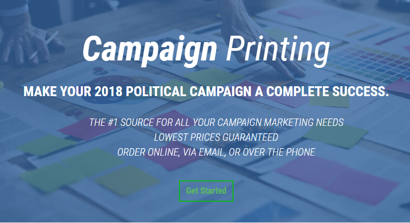
Standing out among the competition can be a large enough factor for most political campaigns for instance. But while some may boldly drop the typical blue versus red color schemes many politicians cling to for something more ‘far out’ it’s important we remember our audience’s expectations when we jump ship from more traditional designs.
Making things more complicated, there is no right color for your signage or designs, there are just varying levels of ‘correct’. Assuming you have the resources to sample your color themes to your audiences prior to finalizing a design, you are likely to find large appeal among multiple color schemes and ‘keyword responses’ equally mixed among them.
Your signage success is closely tied to the personality your signage carries with it. Does the bold font carry a certain weight with it? Is the imagery rugged or relaxed? These elements create a mental image in your audience’s mind and these result in certain color expectations.
In reality, the psychology of your design isn’t in the color you start with, but the one you end with after considering the factors of the overall design. From this perspective, it’s much easier to find a color theme that suits your needs and offers your audience with the expectations they perceive exist.